![Showreel-Grid-Mobile-[remix] (1).gif](https://static.wixstatic.com/media/dcb71b_0d84e1b1c4ec4ad7b6d35f97c0f8f271~mv2.gif/v1/fill/w_980,h_735,al_c,usm_0.66_1.00_0.01,pstr/dcb71b_0d84e1b1c4ec4ad7b6d35f97c0f8f271~mv2.gif)
Project
Book It
Designed a decentralized mobile book exchange application to facilitate borrowing & lending for users.
Addressing the gap in access to library infrastructures in India, Book It is a community-centric decentralized mobile book exchange app that has a shared inventory of 1500+ book titles, 315+ users and 250+ book exchanges.
This project is close to my heart!
I moved to India from the U.S. in middle school. I loved to read but did not have access to any libraries in India to borrow books from. A few years later, I began tutoring some girls from a neighboring town and realized that there was a shared need for books amongst people in my society! So, I designed Book It to make reading books more accessible!!
Info
Case Study
Addressing the gap in access to library infrastructures in India
Role
Conceptualized, designed, and oversaw the development of the app from start to finish
Timeline
January 2023 - January 2024
Tools
Figma, Miro, InVision
Impact
Created a shared inventory of 1500+ books among 315 residents.
Expanded user base by 3x in the span of 4 months
Facilitated over 250 book exchanges, reducing book expenses by 40% for participating families.
Problem
Lack of adequate library infrastructure in India limits access to free learning resources
While many individuals find books unaffordable, others possess more than they can utilize. There is no platform to bridge this gap and connect these user groups for a more equitable access to educational materials and resources for learning.
But what if we could switch the narrative?

Solution
Book It is a borrowing and lending mobile application designed to improve access to education in communities.
Book It is a borrowing and lending platform designed to promote book sharing to conserve resources and improve access to education & a passion for learning in local communities.

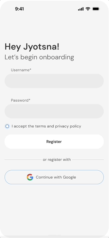
Feature #1
Getting Started
Users need to set up their profile and details to begin lending and borrowing on this app!
.png)
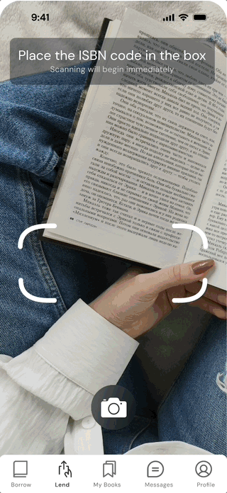
Feature #2
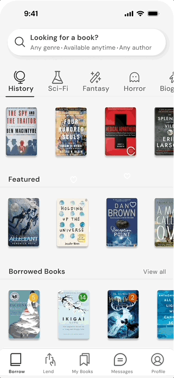
Building connections with book borrowing
The book borrowing process involves submitting a request to borrow the book and contacting the lender. This encourages a community-driven experience that promotes learning and sharing simultaneously.

Research
Why do we need libraries and how do they shape learning?
“The National Education Policy (NEP) 2020 highlights that only 34% of Indian schools have functional libraries.”
“Providing books and reading spaces to students led to a 20% increase in children’s reading fluency over one academic year.”
User Survey (53 responders)
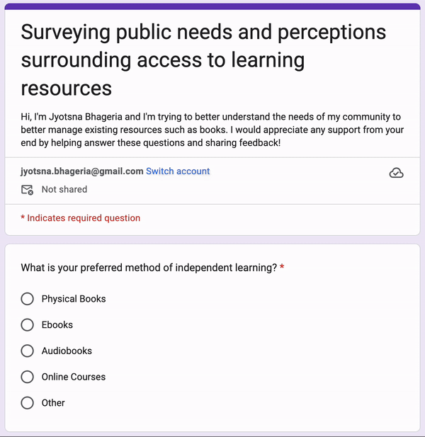
Lack of free resources
68%
Most people don't have access to books or the economic resources to purchase them.
Lack of community for users
52%
There is a lack of community for avid readers and learners.
Unused resources and books
77%
There are people who have resources collecting dust in their homes.
77% of surveyed people had books they were willing to lend, showing latent resources we could mobilize.
User insights
Users want access to free books & an easy borrowing experience
From conversations with friends and observing interactions between people in my community I realized that there were many residents that needed access to books but had a difficult time finding people they could borrow from.
Here's what I learned!

Prefer reading physical books
Most people want to read books physically for the experience

Prefer to borrow than purchase books
It's a lot easier to borrow books than buy books again and again.

Difficult to access free learning resources
Without access to libraries, there are few opportunities for people to get books.
Moving forward
I realized the real issue was not a shortage of books — it was the unequal distribution and limited access to them.

From user interactions I learned that people want to borrow and lend books from each other. I customized each user flows to fit the user needs for that action.

Low-fidelity prototypes
Developing ideas further
After some initial sketches, I created mid-fi wireframes to build out interactions and flows to test with users. The following shows the mobile version of the app.

User testing with high-fidelity prototypes
Usability testing with higher fidelity prototypes helped me understand needs.
I designed higher fidelity prototypeds to gauge user reactions and preferences to different features and nuances within the app. Not only that, but I got the opportunity to test different user interfaces and improve visual aesthetics as well.

Here's what I learned from users!

After

Before
The “Private” and “Public” options have low contrast and appear like buttons, causing confusion about whether they are selectable options or interactive buttons.
Users struggled to view book details clearly due to the small book cover size and lack of zoom functionality.
After
40% decrease in accidental selections of “Private” vs. “Public,” as users now recognize these as visibility settings rather than buttons.
45% more users view the book cover, indicating that the larger size makes it easier to interact with.


Before
Users found it hard to go back and find another book, as there was no intuitive navigation to explore titles easily.
Users struggled to differentiate between available and unavailable books due to lack of visual cues.
After
40% decrease in time spent searching for the next book, due to swipe navigation.
30% decrease in misclicks on unavailable books, thanks to clearer distinction ( darkened and red border).


Before
There’s no indication of book ratings, which can be helpful for users in choosing recommended books.
Too complicated UI due to the rectangular frames, users expressed confusion navigating the platform.
After
50% of users considered ratings in their decision-making, thanks to the added visual cues.
Average time spent finding a book reduced by 30%, as the layout is easier to scan.


Before
“Days left” text under book covers is easy to miss.
Sections are tightly packed, creating a crowded, overwhelming interface.
After
20% improvement in on-time returns as users can easily track due dates with the new color-coded badges.
40% more users interact with redesigned genre icons,
showing improved discoverability of book categories.
Design systems & branding
Creating cohesive branding
.png)
.png)
.png)

Check out my other projects!

.png)